Create Visualizations
Overview
This article describes how to visualize your data by creating visualizations in Analytical Designer.
You can also create visualizations directly from a Dashboard. For details, see Manage Visualizations on Dashboards.
Create a Visualization
Follow these steps to create a new visualization.
Steps:
Open your workspace.
Click the Analyze tab to open the Analytical Designer.
Drag a fact (
 ), a metric (
 ), or an attribute (
 ) from the Data Catalog onto any drop zone to visualize it.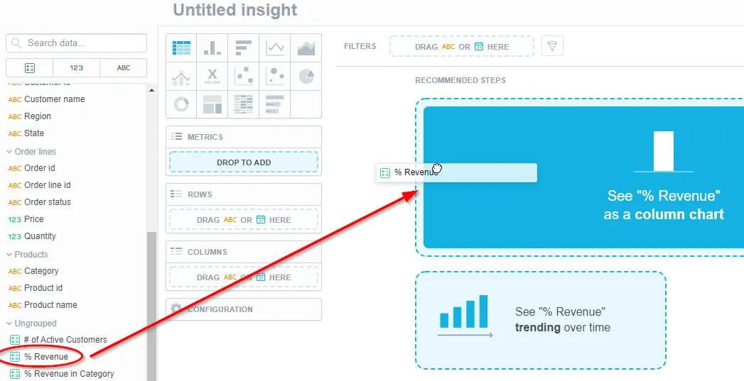
By default, the visualization is displayed as a table.
You can create new metrics or edit existing ones without having to stop working on your visualization. See the Metric Editor in Analytical Designer section for details.
To change the visualization type, click the appropriate icon at the top.
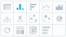
You can display the visualization as a table or different types of charts.
Different charts require different types of data. If you change the chart type, the visualization may change the displayed data as well.
For example, you can set a Stack by for a column chart, but not for a pie chart.
For details about different types of visualizations, see the Visualization Types section.
Use the Save button to save the visualization.

Use the Undo and Redo buttons in the top bar to browse through your edits.
To remove all data from the visualization, click Clear.

Adjust the properties of the visualization, such as colors, axes, and legends. For details, see the Configure Visualization Properties section.
Add a descriptive tooltip to your visualization to provide context for users - hover over the question mark icon next to the visualization’s name and click the text box fill in the text.
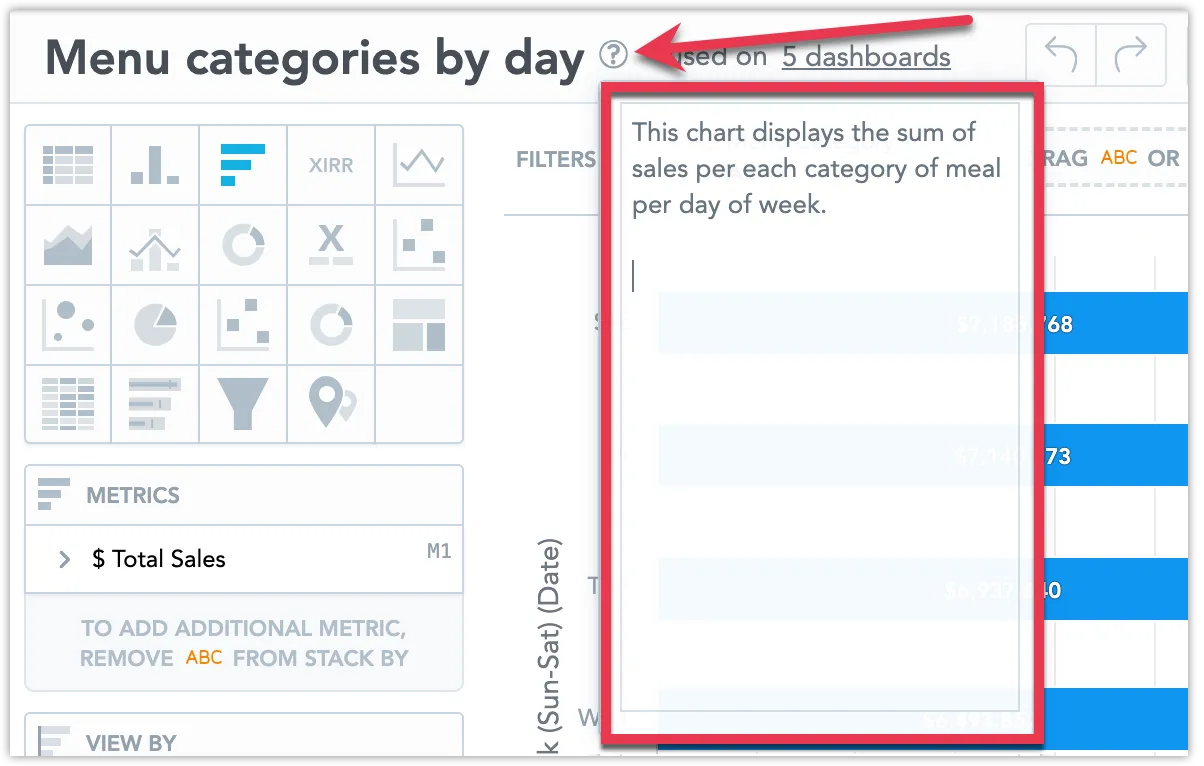
You can use markdown to customize format text and add hyperlinks and images to the descriptive tooltip. For guide on how to use markdown, see Formatting Options for Rich Text.
Refine Metrics
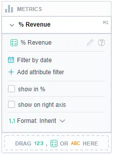
To refine the data from individual metrics, update them in the Metrics section. You can:
Show values in percents.
(Facts only): Select which calculation to use to display the data.
Customize the format of individual facts and metrics in your visualization.
For details, see the Format Numbers section.
Add Granularity
To add granularity to the displayed data, drag Date ( ) or an Attribute () to the Rows/Columns section for tables or use the View by/Trend by/Attribute section for other types of visualizations.
If you do not see the View by/Trend by section, try to change the type of visualization.
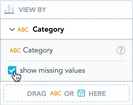
To display also attribute values without any data, select the Show missing values option. The visualization then displays all attribute values, even if the metric values are missing.
You can also use the FOR EACH clause to create metrics that automatically show all attribute values. For details, see FOR EACH.
Attributes
If you add Attributes, you can select which attribute label should be used to display the attribute values (the Display as option).
You can use text labels, hyperlink labels, and geo labels.
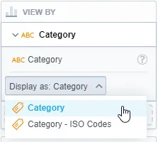
You must define the additional attribute labels in your logical data model. See the Manage Labels section.
Dates
If you add Date, you can display the data:
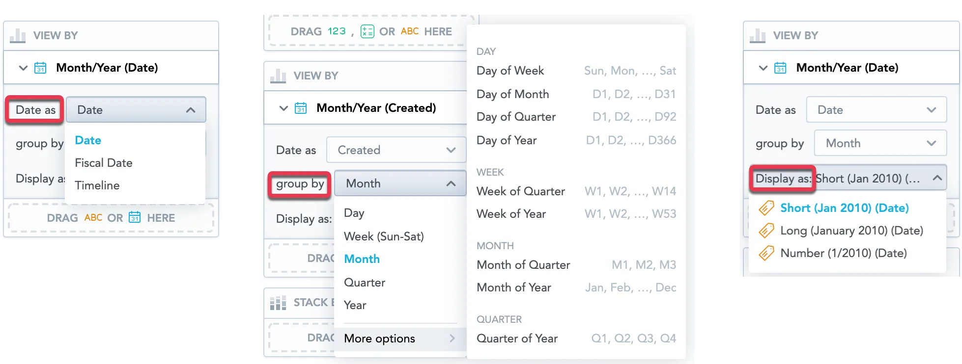
In various date dimensions as defined by your logical data model (the Date as option)
Group them by day, week, month, quarter, year, or additional date attributes, such as day of week or month of year (the Group by option)
Select which attribute label should be used to display the values (the Display as option)
When you group the data By day, the Display as option is not available.
All visualizations display the date in the following format: MM/DD/YYYY. You can change the format in your account settings. For details, see the Change Date Format section.
Add Filters to the Whole Visualization
To filter the whole visualization, you can:
Drag and drop the date and other attributes to the top bar.

Click the filter icon on the filter bar and enable filters in the dropdown menu.
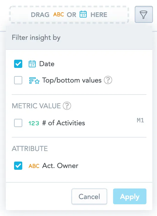
If you also add a date attribute to the visualization (in the View by/Trend by/Attribute/Rows/Columns sections), the following applies:
- If you change the date dimension in the visualization, the dimension also changes in the date filter.
- If you change the date dimension in the date filter, the dimension in the visualization stays unchanged.
Add Filters to Metrics
You can filter each metric by up to 20 attributes. All filters are applied at the same time (using the AND operator).
The resulting visualization matches all the applied metric level filters.
Stack Data
To split the display into a stacked chart, drag an attribute to the Stack by/Segment by section.
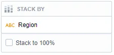
If you do not see the Stack by/Segment by section, try to change the type of the visualization.
To use Stack by (or Segment by for line charts), the visualization must have only one item in the Metrics section.
Sort Data
Sorting is available for bar charts, column charts, area charts, combo charts, bullet charts, pie charts, donut charts, and heatmaps.
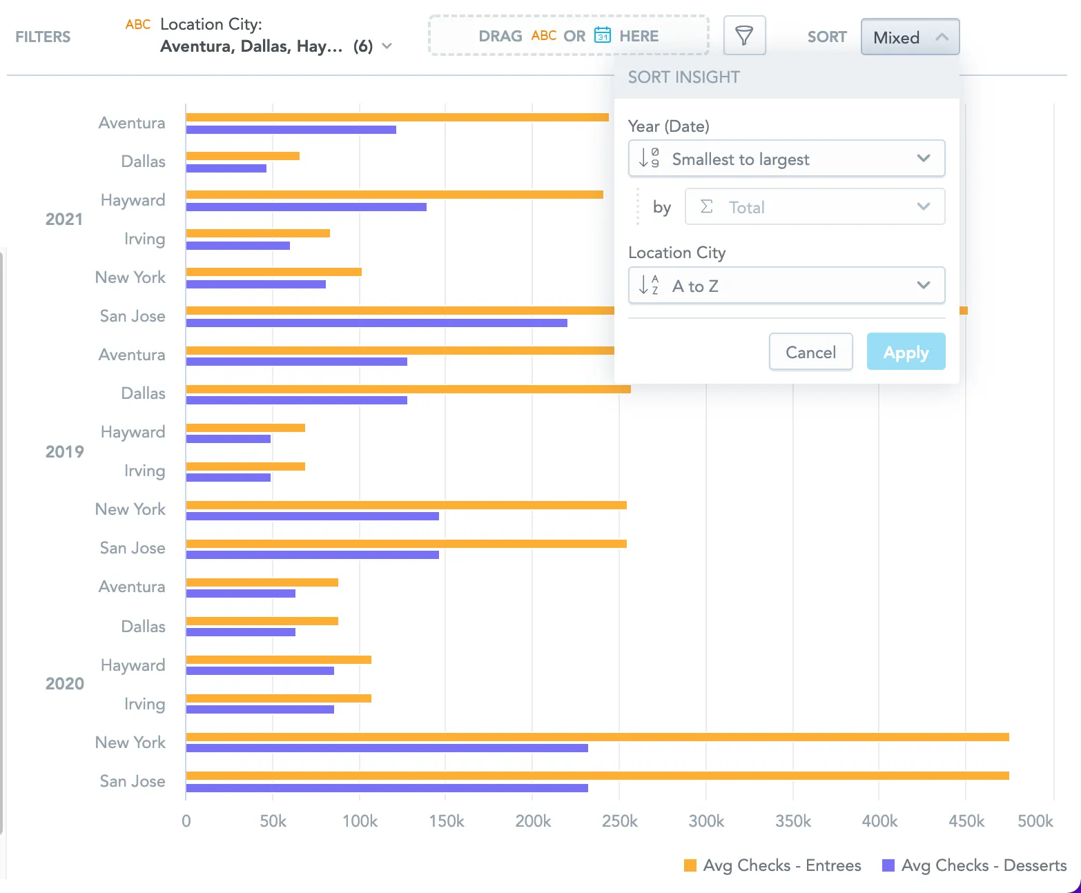
You can use alphabetical, numerical, or chronological sorting to order the data in your visualizations.
Recommendations
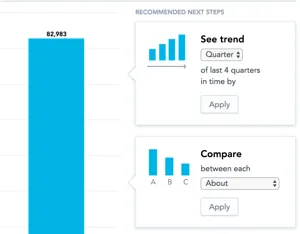
As you create visualizations, Analytical Designer offers you Recommended next steps.
The recommendations that appear when you add metrics and attributes are based on actions that GoodData users typically perform in similar analytical scenarios:
Partial Data Results
Partial Data Results help users keep working with large datasets while making it clear that the displayed data is incomplete. When a limit is reached and a visualization contains more data than GoodData can display, the visualization shows the available subset of data and a warning that explains what happened.
The warning can include:
- the type of limit that was reached, such as a SQL result size limit, cross tabulation row limit, or visualization data point limit
- the configured limit
- the actual value or approximate value, when available
- how far the result is over the limit
- suggested actions, such as adding filters or increasing aggregation
Partial data is never shown silently. If GoodData displays only part of the result, the visualization includes a warning so users can interpret the data correctly.
Totals in Partial Results
When a visualization shows partial data, totals are not calculated or displayed. This prevents users from reading a total value as complete when the visualization contains only part of the result.
Note
In this context, a total means an aggregated value shown by the visualization, such as a table total or subtotal. A total count in a warning message means the size of the result that exceeded a system limit, such as the number of rows, columns, or data points. These are different concepts.
Export Data from Partial Results
If a visualization shows partial data, users can still export the full dataset through raw CSV export when the export is available. Other export types may include only the displayed partial data or may be limited by export-specific constraints.
Configure Partial Data Results
Partial Data Results are controlled by administrators. When the feature is enabled (using the Partial results setting in Settings > Appearance & behavior), supported limit breaches can return partial data with a warning. When the feature is disabled, GoodData shows an error instead of partial data, but the error message still includes more detailed limit information where available.
Visualization authors can use filters, aggregation, and lower display limits to create faster previews for dashboard users.
Limitations
- Partial results may not be deterministic or representative of the full dataset.
- Exact total counts may not be available for every limit type.
- Totals and subtotals are not calculated or displayed for partial data results.
- End users cannot configure system limits.
- Scheduled tabular exports from a partial data state may be restricted, except for raw CSV export.
- GoodData does not optimize the query automatically when a limit is reached.
Edit Visualizations
Follow these steps to edit an existing visualization.
Steps:
Click Open in the top bar.
Select the visualization to edit.
The visualization opens for editing.
Update the visualization and click Save.
The visualization is updated and saved.
Delete Visualizations
Follow these steps to delete a visualization.
Steps:
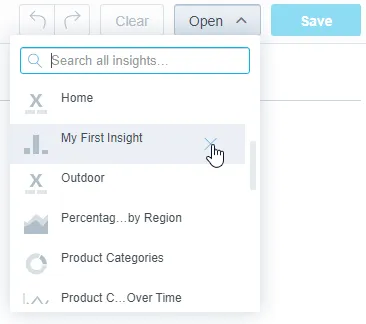
Click Open in the top bar.
Hover over the visualization that you want to delete.
Click the cross icon next to the visualization name.
Confirm the deletion.
The visualization is deleted.
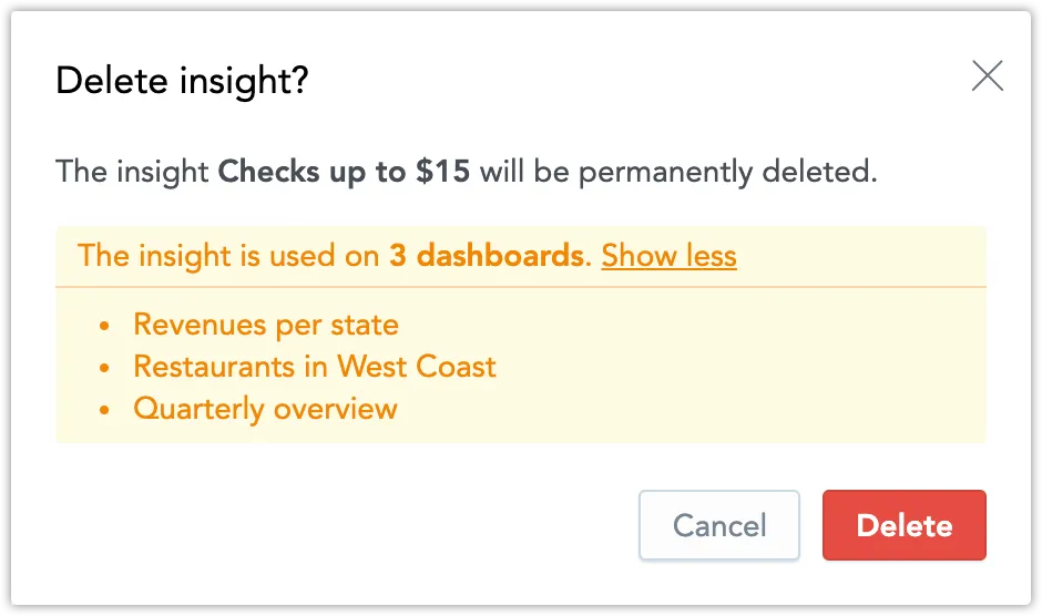
If the visualization is placed on a Dashboard or used in drilling from Dashboards, Analytical Designer warns you and displays a clickable list of the Dashboards using this visualization.
When you click delete, the visualization is removed from the dashboards and drilling.