Use Ranking Filter
Ranking filters narrow a visualization to the highest or lowest ranked values. For example, you can show the top 5 restaurants by revenue, the bottom 10 salespeople by quota attainment, or a revenue trend limited to the top 10 products.
Use ranking filters when you want to focus only on the most relevant values without adding extra metrics or attributes to the visualization.
A visualization can have one ranking filter. The visualization does not need to have a metric in the Metrics section. You can select the metric used for ranking directly in the ranking filter.
Ranking filters are applied after date filters, attribute filters, and metric value filters.
Note
The ranking filter is also applied when you add the visualization to a dashboard. However, you can edit this filter only in Analytical Designer.
Ranking Directions
Ranking filters support the following directions:
| Direction | Result |
|---|---|
| Top | Shows the highest-ranked values. If multiple values are tied at the ranking boundary, all tied values are shown. The visualization can show more items than requested. |
| Top (Strict) | Shows exactly the requested number of highest-ranked values. If values are tied at the ranking boundary, which tied values are included is not guaranteed and may vary between queries. |
| Bottom | Shows the lowest-ranked values. If multiple values are tied at the ranking boundary, all tied values are shown. The visualization can show more items than requested. |
| Bottom (Strict) | Shows exactly the requested number of lowest-ranked values. If values are tied at the ranking boundary, which tied values are included is not guaranteed and may vary between queries. |
For non-strict directions, ties are preserved. For strict directions, the number of returned items is limited to the exact number you set.
Important Notice
With real-time data sources, repeated exports may contain different tied values when a strict ranking filter is used. Separate queries can select different values from a tie at the ranking boundary.
Configure a Ranking Filter
In the visualization you want to filter, click the + button in the filter bar.
Select Top/bottom values.
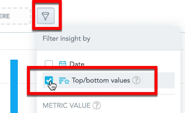
Analytical Designer adds the ranking filter to the filter bar.
Click the filter in the filter bar.
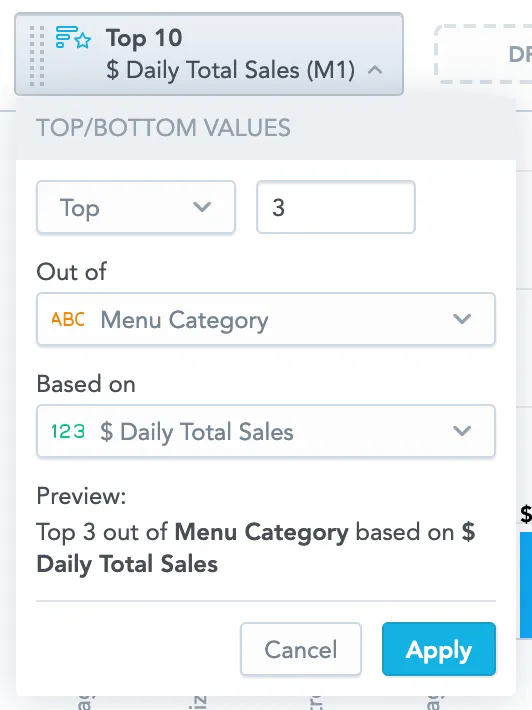
Select the ranking direction and specify a number.
In Based on, select the metric used to calculate the ranking.
The ranking metric does not have to be displayed in the visualization.
In Out of, select the attributes or dates whose values are ranked.
You can use attributes or dates from the visualization or compatible attributes and dates that are not displayed in the visualization.
Click Apply.
Analytical Designer now filters the visualization according to your ranking filter.
Understand the Out of Setting
The Out of setting defines the level of detail at which the ranking metric is calculated. Analytical Designer ranks the values, or combinations of values, of the selected attributes and dates.
For example, if the visualization shows Daily Total Sales by Year and Menu Category, and you select Top 3 out of Menu Category based on Daily Total Sales, Analytical Designer identifies the top three menu categories across the complete selected data context. This means the top three Menu Category items are determined using only your specified ranking attributes, completely ignoring any other breakdown attribute dimension. Analytical Designer then displays those same menu categories for each year shown in the visualization.
Dimensions displayed in the visualization but not included in Out of do not split the ranking into separate contexts. In this example, Year does not cause Analytical Designer to calculate a different top three for each year.
A menu category that is in the top three for one year only, but not in the top three across the complete selected data context, is not included.
If you select Top 3 out of Product Brand, Analytical Designer returns the three product brands with the highest total value of the ranking metric. If the visualization also shows years, those same three brands are displayed across the shown years.
If you select Top 3 out of Year, Analytical Designer returns the three years with the highest total value of the ranking metric.
If you select multiple attributes or dates in Out of, Analytical Designer ranks their combinations. For example, selecting Top 3 out of Year and Product Brand returns the top three Year and Product Brand combinations.
Use a Different Ranking Metric
The metric used for ranking does not have to be displayed in the visualization.
For example, you can display Revenue by Product but filter the result to the top 5 products by Quantity Sold.
In this case:
- The visualization metric is
Revenue. - The ranking metric is
Quantity Sold. - The ranking direction is
Top. - The ranking limit is
5. - The Out of setting is
Product.
This lets you use one metric to decide which values are important and another metric to display the result.
Use Ranking in a Metricless Visualization
You can use a ranking filter even when the visualization does not display a metric.
For example, you can create a table with Customer City and apply a ranking filter that shows the top 10 customer cities based on # of Orders. The table displays only the selected cities, even though # of Orders is used only by the filter.
Use a Different Ranking Level
The ranking level does not have to match the attributes or dates displayed in the visualization.
For example, you can display a revenue trend by month and filter it to the top 10 products by total revenue.
In this case:
- The visualization displays
Revenueby Month. - The ranking filter ranks
Product. - The ranking metric is
Revenue. - The ranking direction is
Top. - The ranking limit is
10.
The visualization then shows the monthly revenue trend for the same products that match the top 10 product ranking condition across the complete selected data context.
Ranking Ties
For Top and Bottom, Analytical Designer shows all values tied at the ranking boundary. This means the visualization can show more items than the number you set.
Example:
You want to see the top 5 menu categories that sold best.
The table displays 6 items with 4 different values.
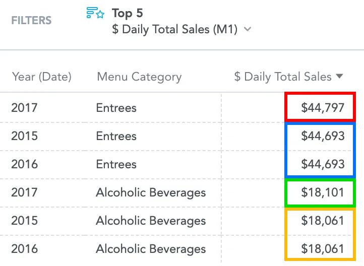
Explanation:
- The highest sales value is $44,797, so it is item 1.
- Two items have $44,693, so they are items 2 and 3.
- One item has $18,101, so it is item 4.
- Two items have $18,061, so they are items 5 and 6.
Because the fifth value is tied, Analytical Designer displays both tied items.
To return exactly 5 items, use Top (Strict). If the fifth value is tied, only the number of values required to reach the limit is included. Which tied values are included is not guaranteed.
Examples
Your visualization contains Daily Total Sales by Year and Menu Category.
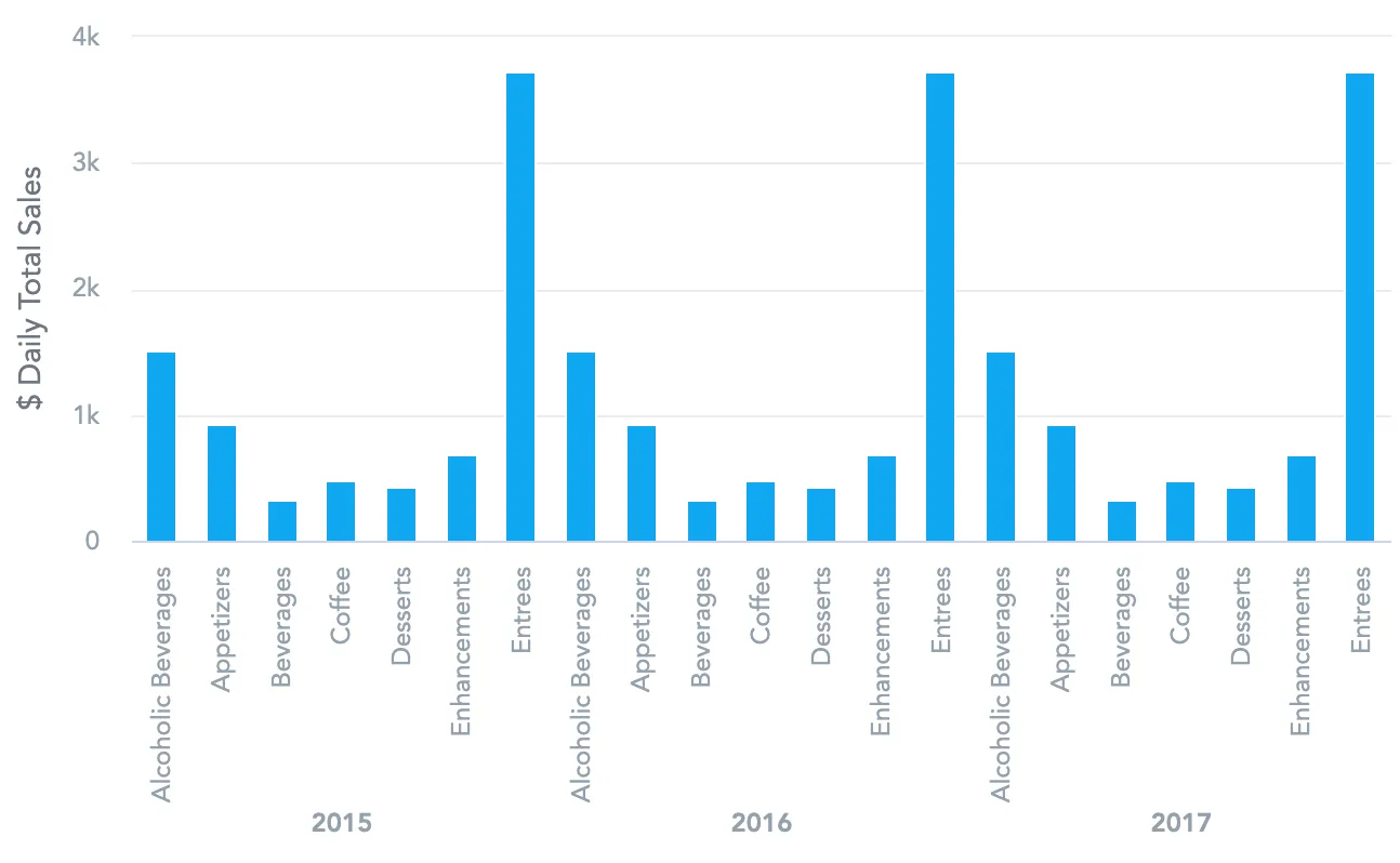
To see the trend for the top three menu categories across the complete selected data context, select Top 3 out of Menu Category based on Daily Total Sales.
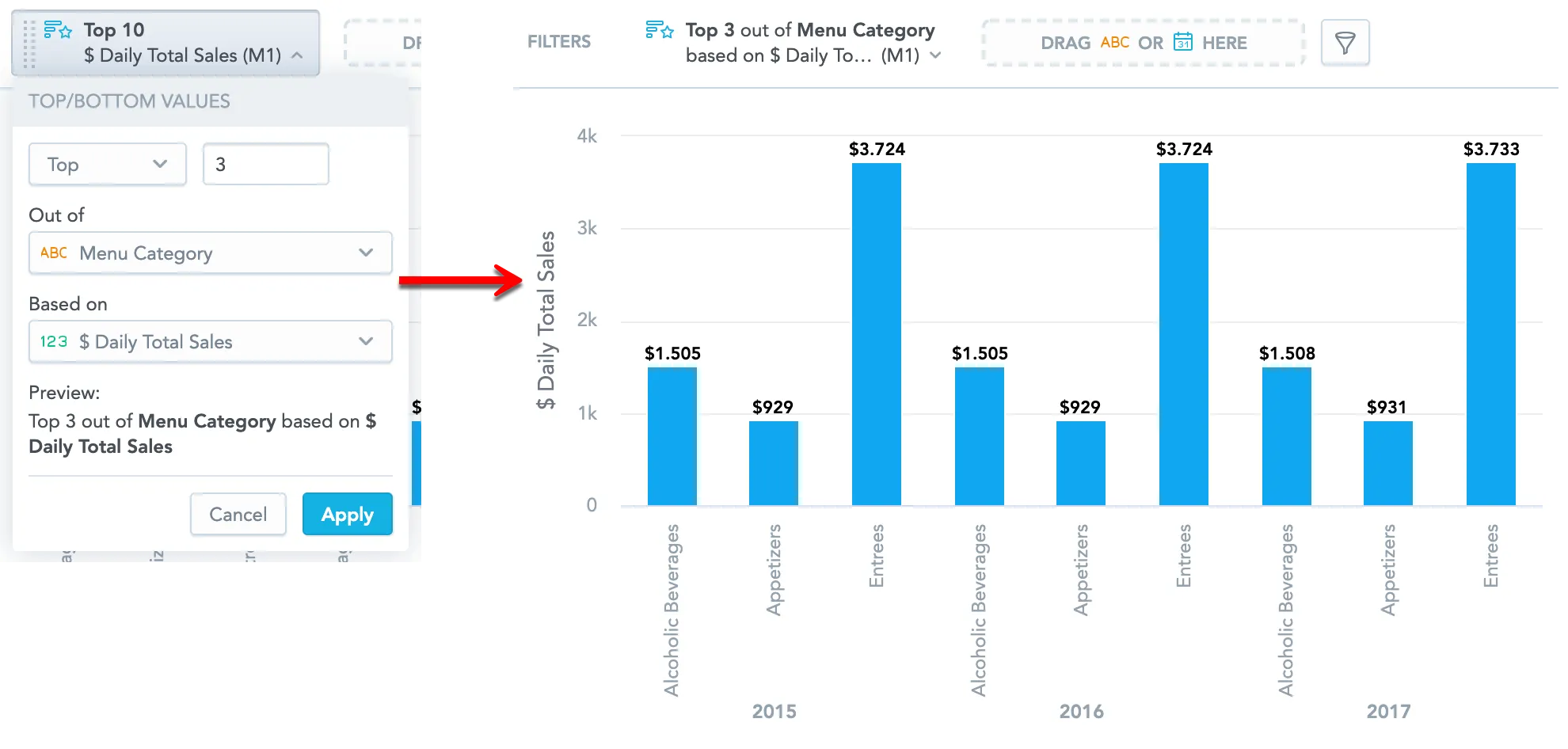
Analytical Designer first identifies the top three menu categories across the complete selected data context. It then displays those same categories for the years shown in the visualization.
To rank combinations of values, add multiple attributes or dates to Out of. For example, selecting Top 3 out of Year and Product Brand selects the top three Year and Product Brand combinations.
Current Limitations
- Each visualization can have one ranking filter.
- Ranking is calculated across the complete selected data context. Analytical Designer cannot calculate a separate Top or Bottom N within each displayed period or attribute value. Adding multiple attributes or dates to Out of ranks their combinations instead.
- The ranking filter is not compatible with the Rollup (total) aggregate function in tables. If you use this aggregate function and enable the ranking filter, the rollup is removed.
- If you display a fact or metric in percent by using Show in %, the ranking filter disables this option.