Donut Chart
Donut charts show data as proportional segments of a disc with a hollowed out center. Donut charts can be segmented by either multiple metrics or an attribute, and allow viewers to visualize component parts of a whole. Similar to pie charts, they are mostly used for showing the proportion or distribution of categorical data. For example, a donut chart can represent the percentage of market share for different companies, with each segment indicating the relative size of a company’s market share. Donut charts provide an intuitive and visually appealing way to understand relative proportions within a data set.
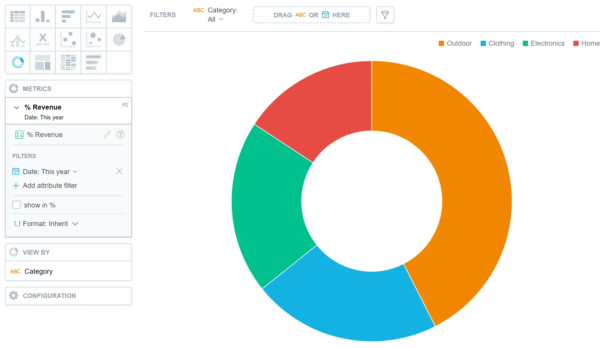
In donut charts, you can also:
Display the values as a percentage. To do so, add a date or an attribute to the View by section.
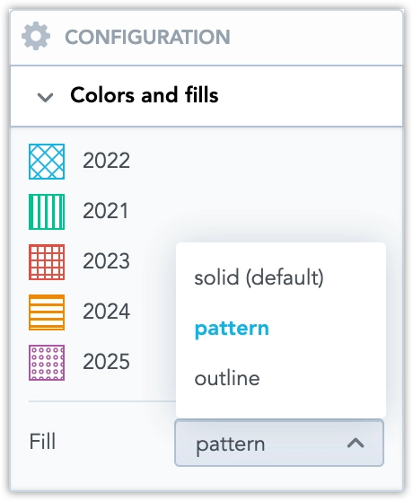
In Configuration > Colors and Fills > Fill, you can choose how chart segments are displayed:
- Pattern fill: Replaces solid colors with patterns (like crosshatching). This makes values easier to tell apart because they differ by both color and texture.
- Outline fill: Tones down solid colors and shows emphasized outlines. This style is useful when you want to overlap another chart (for example, a line chart on top of a column chart) because it improves contrast and separation.
See the Change Chart Fills section for further details.
In Configuration > Canvas > Labels style, you can choose Backplate to add a background behind chart labels. This makes labels easier to read because the backplate (white by default) creates higher contrast with the chart colors.
For information about common characteristics and settings of all visualizations, see the Visualization Types section.