Pie Chart
Pie charts show data as proportional segments of a disc. They can be segmented by either multiple metrics or an attribute, and allow viewers to visualize the composition or distribution of a whole. Pie charts are commonly used to display market shares, budget allocations, or demographic distributions. For example, a pie chart can illustrate the percentage of sales contributed by different product categories.
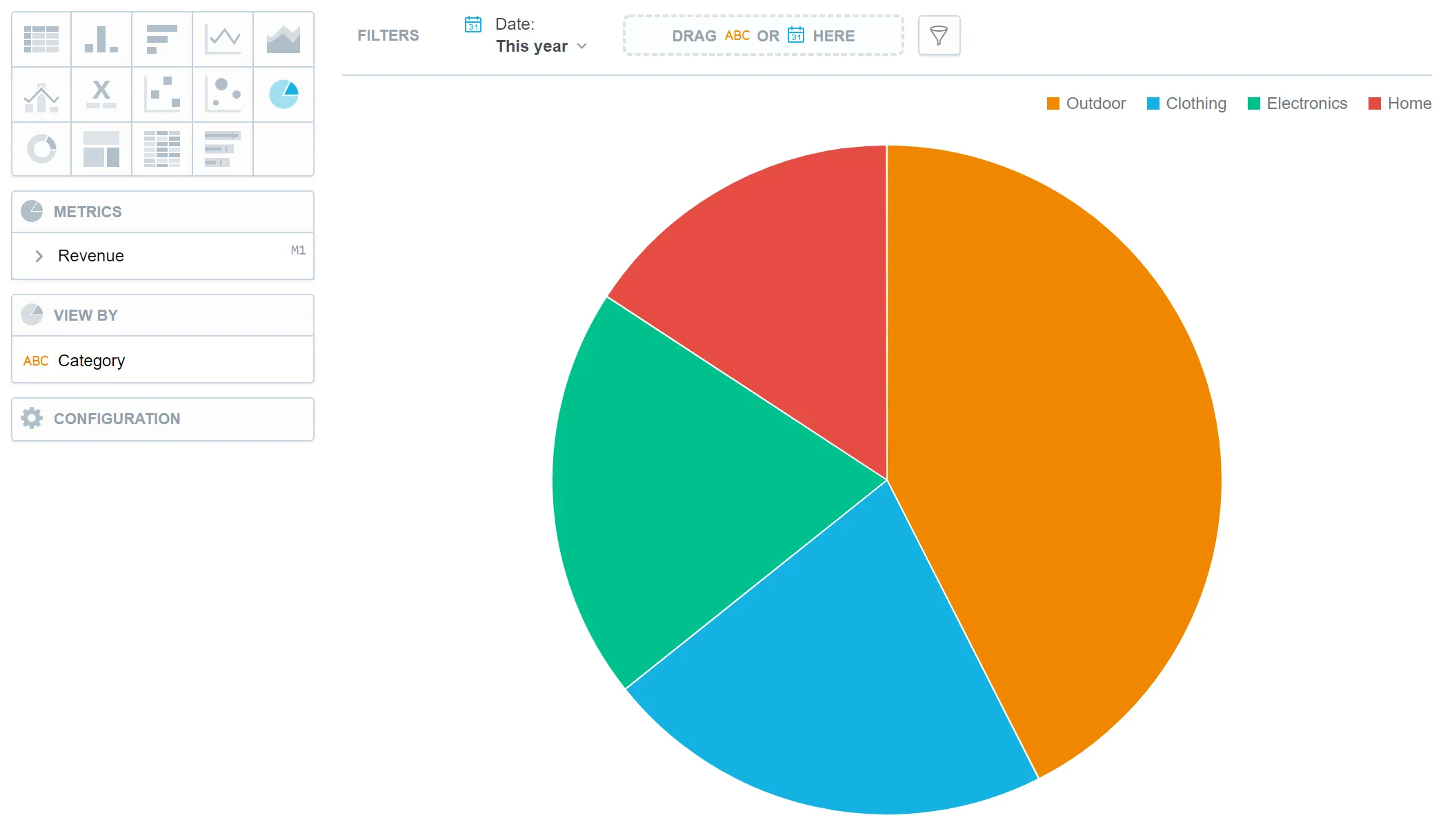
Pie charts have the following sections:
- Metrics
- View by
- Configuration
In pie charts, you can also:
Display the values as a percentage. To do so, add a date or an attribute to the View by section.
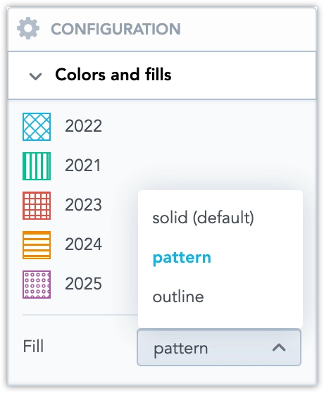
In Configuration > Colors and Fills > Fill, you can choose how chart segments are displayed:
- Pattern fill: Replaces solid colors with patterns (like crosshatching). This makes values easier to tell apart because they differ by both color and texture.
- Outline fill: Tones down solid colors and shows emphasized outlines. This style is useful when you want to overlap another chart (for example, a line chart on top of a column chart) because it improves contrast and separation.
See the Change Chart Fills section for further details.
In Configuration > Canvas > Labels style, you can choose Backplate to add a background behind chart labels. This makes labels easier to read because the backplate (white by default) creates higher contrast with the chart colors.
For information about common characteristics and settings of all visualizations, see the Visualization Types section.
Limits
| Bucket | Limit |
|---|---|
| Metrics | 20 metrics (to add more than one metric, Stack by bucket must be empty) |
| View by | 1 attribute (this bucket is available only if there is exactly one metric) |