Custom Tooltips
Experimental Feature
This is an experimental feature that is still under active development. Its behavior may change in future releases, or the feature may be removed.
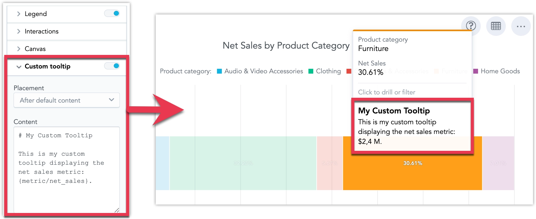
Custom tooltips let you control what users see when they hover over a data point in a visualization. Instead of relying only on the default auto-generated tooltip, you can add your own Markdown-based content before or after the default tooltip content, or replace the default tooltip content completely.
Configure a Custom Tooltip
Custom tooltips are configured in Analytical Designer and are used when the visualization is added to a dashboard.
Steps:
Open a visualization in Analytical Designer.
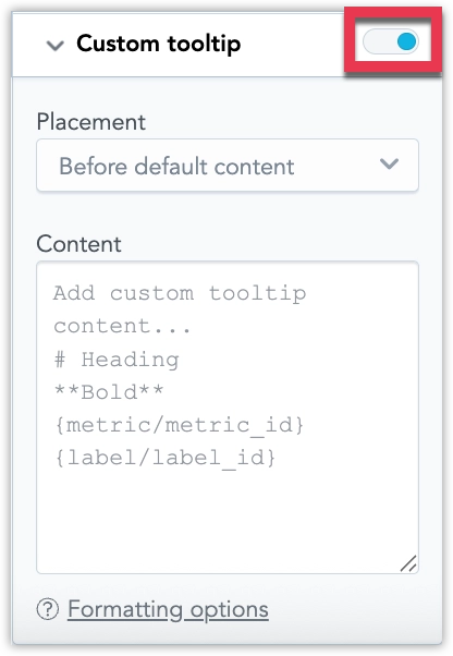
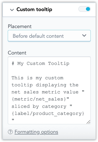
In the Configuration panel, enable Custom tooltip.
Add your custom tooltip content. See Supported Markdown for what you can use.
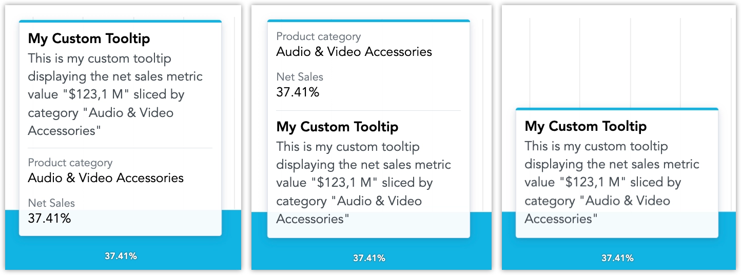
By default, the custom tooltip content is displayed before the default tooltip content. You can change this to display it after the default tooltip content, or to replace the default tooltip content altogether.
Save your visualization.
Supported Markdown
Custom tooltips support a constrained subset of Markdown intended for short, readable tooltip content:
Plain text and paragraphs
**Bold text**
*Italic text*
# Heading
- Bullet list item
1. Numbered list item
---
[Link text](https://example.com)

{metric/metric_id}
{label/label_id}Use {metric/metric_id} and {label/label_id} to reference metrics and labels in the tooltip. The referenced values are evaluated for the hovered data point and respect dashboard and visualization filters.
If a referenced value cannot be resolved, the tooltip displays one of the following states:
- No data
- Multiple items
- Data could not be retrieved
Use headings to distinguish the tooltip title from the body text. Only single-level headings using # are supported.
Keep lists short and simple. Ordered and unordered lists are supported, but deeply nested lists are not recommended.
Images scale to the tooltip width and must not overflow the tooltip container. We recommend using no more than one image per tooltip and keeping the image height around 120–160 px. Always provide alt text for images.
Horizontal dividers using --- are supported and should be used as subtle separators between sections.
The following Markdown and HTML features are not supported:
##and###headings- blockquotes
- code and code blocks
- tables
- HTML