AI Assistant
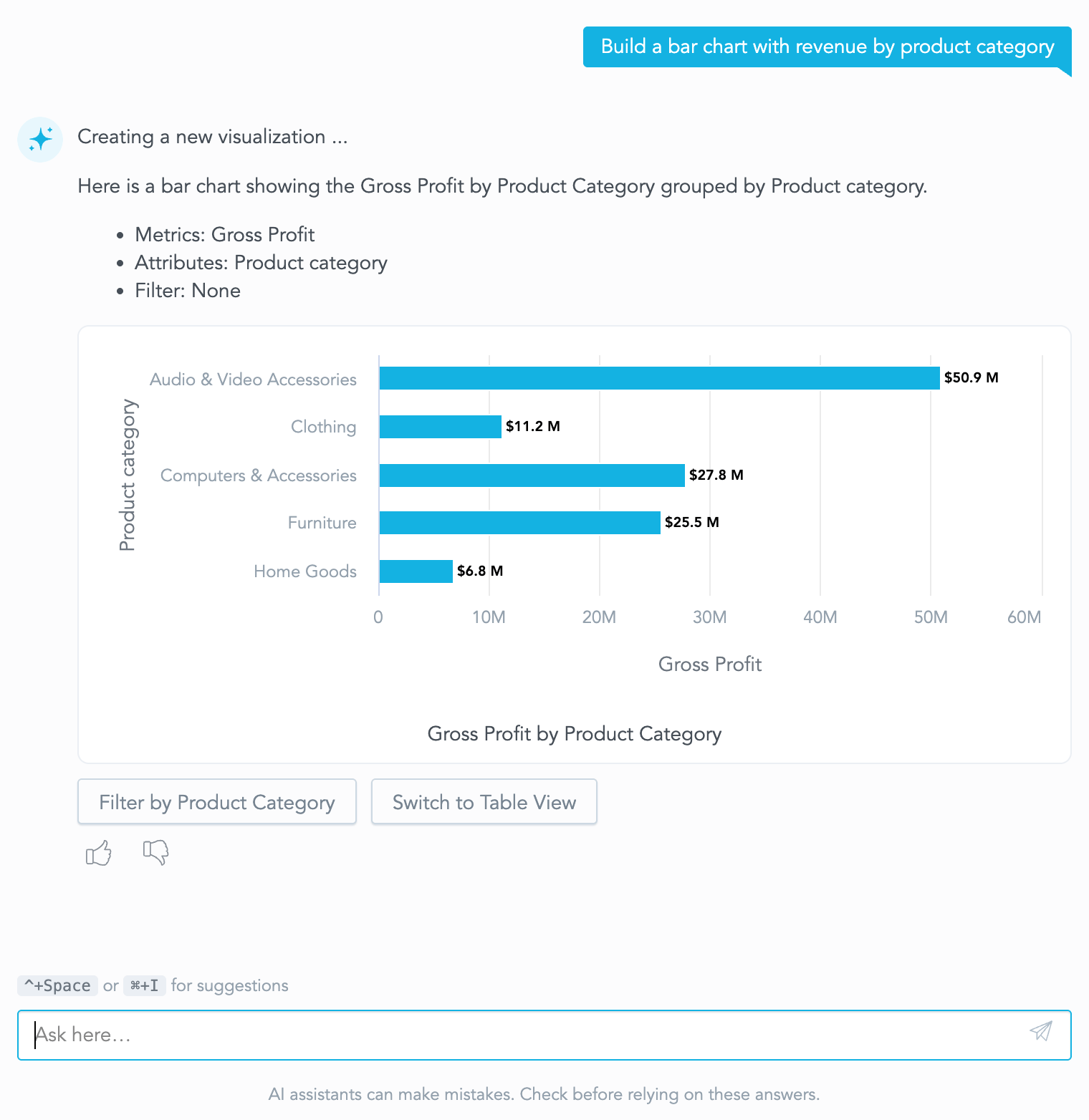
GoodData.UI provides a React component for embedding of the chat interface for AI Assistant.
Prerequisites
Before you can use the AI Assistant, you need to make sure it is properly set up in GoodData Cloud. For detailed instructions, see Configure AI Assistant.
If you are using GoodData.CN, some additional configuration may be required. For details, see the AI in GoodData.CN section of the article.
AI Assistant Component Features
- Embed UI for the AI Assistant chat.
- Subscribe to chat events.
- Handle links in chat messages.
- Theming is supported out of the box through Theme Provider.
- Customization of the initial assistant experience (welcome content and suggested questions).
- Dedicated conversations list component for split-layout integrations.
- Shared
GenAiStorewrapper for synchronizingGenAIAssistantandGenAIConversationsin one Redux store. - Key Driver Analysis dialog component for explaining changes and exploring data drivers on charts.
Basic integration example
GenAIAssistant component renders chat history and an input field for sending user messages.
It does not include the logic for overlay management in case you want to render it in a floating window.
import {
    GenAIAssistant,
    ChatUserMessageEvent,
    isChatUserMessageEvent,
    LinkHandlerEvent,
} from "@gooddata/sdk-ui-gen-ai";

// Import required styles
import "@gooddata/sdk-ui-gen-ai/styles/css/main.css";

const App = () => {
    return (
        <div style={{ width: 500, height: 600, display: "flex" }}>
            {/* Wrap the chat UI in a container of desired size */}
            <GenAIAssistant
                // Optionally, add event listeners
                eventHandlers={[
                    {
                        eval: isChatUserMessageEvent,
                        handler: (event: ChatUserMessageEvent) => {
                            console.log(`User message: ${event.question}`);
                        },
                    },
                ]}
                // Optionally, provide links handler
                onLinkClick={(linkClickEvent: LinkHandlerEvent) => {
                    linkClickEvent.preventDefault();
                    console.log(`User click: ${linkClickEvent.itemUrl}`);
                    // E.g. when user asks the chatbot to find
                    // a specific dashboard and clicks on the result
                }}
                // Optionally, provide dispatcher for sending messages in the chat
                onDispatcher={(dispatch) => {
                    // Save dispatcher and use it to send messages
                }}
            />
        </div>
    );
};
Props
| Name | Type | Default | Description |
|---|---|---|---|
| locale | ILocale | “en-US” | Specifies the locale for internationalization |
| backend | IAnalyticalBackend | - | Backend instance. Falls back to BackendProvider context if not specified |
| workspace | string | - | Workspace ID. Falls back to WorkspaceProvider context if not specified |
| colorPalette | IColorPalette | - | Color palette used for rendering the visualizations. If not provided, the default color palette will be used |
| catalogItems | CatalogItem[] | - | Catalog items used for autocompletion. If not provided - will be lazy-loaded when needed |
| settings | IUserWorkspaceSettings | - | Workspace settings used by the assistant UI |
| eventHandlers | ChatEventHandler[] | - | Event handlers for user interactions with the chat UI |
| onLinkClick | (LinkHandlerEvent) => void | - | Handle user clicks on the catalog items mentioned in chat. |
| allowNativeLinks | boolean | false | Whether to allow native links in chat messages. If false, onLinkClick handler will be fired when clicking on links |
| disableManage | boolean | false | This will disable manage permissions for the user even if the user has them defined. |
| disableAnalyze | boolean | false | This will disable analyze permissions for the user even if the user has them defined. |
| disableFullControl | boolean | false | This will disable full control permissions for the user even if the user has them defined. |
| objectTypes | GenAIObjectType[] | - | Restricts object types used by assistant search and suggestions. |
| includeTags | string[] | - | Includes only tagged metadata objects when assistant resolves relevant content. |
| excludeTags | string[] | - | Excludes tagged metadata objects when assistant resolves relevant content. |
| onDispatcher | (dispatch: EnhancedStore[“dispatch”]) => void | - | Dispatcher callback for assistant actions and state changes. |
| dashboardSelector | DashboardSelectorEvaluator | null | - | Selector that is used to automatically build ambient context for the chat. If it is provided, the chat will automatically load the dashboards and related data from it. Pass null to explicitly clear previously derived ambient dashboard context. |
| slots | IGenAIAssistantSlots | - | Customizations for the Gen AI assistant. |
| className | string | - | Additional class name applied to the root assistant element. |
| mode | “docked” | “fullscreen” | “docked” | Display mode of the assistant. Adapts its internal layout to a compact docked container or to a wide fullscreen one. Does not resize the component. |
| isPreview | boolean | false | Internal preview mode. Uses workspace preview agent and preview conversations. Toggling resets assistant state. |
Display mode
Use mode to switch the assistant between the compact docked layout, intended for a side panel, and the wide fullscreen layout, intended for a full-page section.
The assistant always fills its parent element, so mode does not resize it - sizing and positioning of the chrome around it stays under your control. What the property changes is the internal layout: in the fullscreen mode on large screens, the initial assistant experience is laid out for a wide container, with the suggested questions arranged in a row and the input centered in the available space.
import { useState } from "react";

import {
    GenAIAssistant,
    type GenAIAssistantMode,
    isChatModeChangeEvent,
    type ChatModeChangeEvent,
} from "@gooddata/sdk-ui-gen-ai";

const App = () => {
    const [mode, setMode] = useState<GenAIAssistantMode>("docked");

    return (
        <div className={mode === "fullscreen" ? "my-app-ai-page" : "my-app-ai-panel"}>
            <button onClick={() => setMode(mode === "docked" ? "fullscreen" : "docked")}>
                Toggle fullscreen
            </button>
            <GenAIAssistant
                mode={mode}
                eventHandlers={[
                    {
                        eval: isChatModeChangeEvent,
                        handler: (event: ChatModeChangeEvent) => {
                            setMode(event.mode);
                        },
                    },
                ]}
            />
        </div>
    );
};
The mode can also be changed through the store dispatcher, which is handy when the control that toggles it lives outside of the component tree that renders the assistant:
import { GenAIAssistant, setFullscreenAction } from "@gooddata/sdk-ui-gen-ai";

<GenAIAssistant
    onDispatcher={(dispatch) => {
        dispatch(setFullscreenAction({ isFullscreen: true }));
    }}
/>;
onModeChange event is emitted whenever the display mode changes inside the assistant, so that your application can keep its own chrome in sync. That includes the setFullscreenAction dispatched in the example above, and the expand and minimize control of the chat header when the assistant is embedded in a chat dialog.
The single exception is a change that results in the mode you already passed as mode - that one is not reported, so a controlled application can feed the reported value straight back as mode without a second call.
Note that on small screens the fullscreen layout is always used, regardless of mode. This forced layout is not reported through onModeChange, as it is not part of the mode your application controls.
Conversations list component
Use GenAIConversations when you want to render conversation history and management UI separately from the assistant message pane (for example, in side-by-side layouts).
For a full split-layout wiring example that synchronizes both components (including conversation change/delete handling), see Assistant + Conversations integration.
import {
    GenAiStore,
    GenAIConversations,
    GenAIAssistant,
    setCurrentConversationAction,
    startNewConversationAction,
} from "@gooddata/sdk-ui-gen-ai";

import "@gooddata/sdk-ui-gen-ai/styles/css/main.css";

const App = () => {
    let dispatcher: (action: unknown) => void = () => undefined;

    return (
        <GenAiStore onDispatcher={(storeDispatch) => (dispatcher = storeDispatch)}>
            <GenAIConversations
                onConversationSelect={(conversation) => {
                    dispatcher(setCurrentConversationAction({ conversation }));
                }}
            />
            <GenAIAssistant />
            <button onClick={() => dispatcher(startNewConversationAction())}>New conversation</button>
        </GenAiStore>
    );
};
GenAIConversations props
| Name | Type | Default | Description |
|---|---|---|---|
| locale | ILocale | “en-US” | Specifies the locale for internationalization |
| backend | IAnalyticalBackend | - | Backend instance. Falls back to BackendProvider context if not specified |
| workspace | string | - | Workspace ID. Falls back to WorkspaceProvider context if not specified |
| colorPalette | IColorPalette | - | Color palette used for rendering the visualizations |
| catalogItems | CatalogItem[] | - | Catalog items used for autocompletion. If not provided - will be lazy-loaded when needed |
| settings | IUserWorkspaceSettings | - | Workspace settings used for conversation list behavior |
| eventHandlers | ChatEventHandler[] | - | Event handlers for user interactions with the conversations UI |
| objectTypes | GenAIObjectType[] | - | Restricts object types used by assistant search and suggestions |
| includeTags | string[] | - | Includes only tagged metadata objects when assistant resolves relevant content |
| excludeTags | string[] | - | Excludes tagged metadata objects when assistant resolves relevant content |
| onDispatcher | (dispatch: EnhancedStore[“dispatch”]) => void | - | Dispatcher for conversation-level actions |
| onConversationSelect | (conversation: IChatConversationLocal) => void | - | Called when the user selects a conversation |
| className | string | - | Additional class name applied to the root conversations element |
| isPreview | boolean | false | Internal preview mode. Uses workspace preview agent and preview conversations only |
Shared Store component
Use GenAiStore when you need to render multiple Gen AI UI components (GenAIAssistant,
GenAIConversations, or custom wrappers) with a single synchronized state and dispatcher.
GenAiStore props
| Name | Type | Default | Description |
|---|---|---|---|
| backend | IAnalyticalBackend | - | Backend instance. Falls back to BackendProvider context if not specified |
| workspace | string | - | Workspace ID. Falls back to WorkspaceProvider context if not specified |
| colorPalette | IColorPalette | - | Color palette used for rendering the visualizations |
| catalogItems | CatalogItem[] | - | Catalog items used for autocompletion |
| settings | IUserWorkspaceSettings | - | Workspace settings used by assistant and conversations components |
| eventHandlers | ChatEventHandler[] | - | Event handlers for user interactions emitted by child Gen AI components |
| objectTypes | GenAIObjectType[] | - | Restricts object types used by assistant search and suggestions |
| includeTags | string[] | - | Includes only tagged metadata objects when assistant resolves relevant content |
| excludeTags | string[] | - | Excludes tagged metadata objects when assistant resolves relevant content |
| mode | “docked” | “fullscreen” | - | Display mode of the assistant. Adapts internal layout to a narrow or to a wide container. |
| onDispatcher | (dispatch: EnhancedStore[“dispatch”]) => void | - | Callback called after initialization with dispatcher for the active Gen AI store |
| children | ReactNode | ((genAIStore: EnhancedStore) => ReactNode) | - | Child component(s) or render function wrapped by the shared store |
| isPreview | boolean | false | Internal preview mode. Uses workspace preview agent and preview conversations; toggling resets state |
eventHandlers
Each event handler must comply with the following interface:
export interface ChatEventHandler<TEvent extends ChatEvent = any> {
    /**
     * A guard for a specific event type.
     */
    eval: (event: ChatEvent) => event is TEvent;
    /**
     * Event handler.
     */
    handler: (event: TEvent) => void;
}
@gooddata/sdk-ui-gen-ai provides a set of guards for all the events that can be emitted by the chat UI.
Here is a list of the relevant events:
| Event name | Guard name | Description |
|---|---|---|
ChatResetEvent | isChatResetEvent | Chat history was reset |
ChatUserMessageEvent | isChatUserMessageEvent | User sent a message |
ChatAssistantMessageEvent | isChatAssistantMessageEvent | Assistant responded with a message |
ChatFeedbackEvent | isChatFeedbackEvent | User gave a feedback |
ChatVisualizationErrorEvent | isChatVisualizationErrorEvent | Visualization failed to render |
ChatSaveVisualizationErrorEvent | isChatSaveVisualizationErrorEvent | Chat failed to save visualisation |
ChatSaveVisualizationSuccessEvent | isChatSaveVisualizationSuccessEvent | Chat successfully saved visualisation |
ChatCopyToClipboardEvent | isChatCopyToClipboardEvent | Chat copy to clipboard event |
ChatConversationPinnedEvent | isChatConversationPinnedEvent | Conversation pinned state changed |
ChatConversationPinErrorEvent | isChatConversationPinErrorEvent | Conversation pin/unpin failed |
ChatConversationDeleteEvent | isChatConversationDeleteEvent | Conversation delete requested |
ChatConversationDeletedSuccessEvent | isChatConversationDeletedSuccessEvent | Conversation deleted successfully |
ChatConversationDeletedErrorEvent | isChatConversationDeletedErrorEvent | Conversation delete failed |
ChatConversationRenameEvent | isChatConversationRenameEvent | Conversation rename requested |
ChatConversationRenamedSuccessEvent | isChatConversationRenamedSuccessEvent | Conversation renamed successfully |
ChatConversationRenamedErrorEvent | isChatConversationRenamedErrorEvent | Conversation rename failed |
ChatConversationChangedEvent | isChatConversationChangedEvent | Active conversation changed |
ChatModeChangeEvent | isChatModeChangeEvent | Assistant display mode changed |
ChatAgentChangeEvent | isChatAgentChangeEvent | Assistant agent changed |
ChatContextChangeEvent | isChatContextChangeEvent | Assistant context changed |
ChatDefinitionReceivedEvent | isChatDefinitionReceivedEvent | Dashboard or visualization definition received |
onLinkClick
Handle user clicks on the catalog items mentioned in chat. If not provided, catalog items will be rendered as plain text. Each event contains the following properties:
| Property | Type | Description |
|---|---|---|
| type | string | Type of the metadata object the user clicked on. For example, “dashboard”, “metric” etc. |
| id | string | The ID of the metadata object |
| workspaceId | string | The ID of the workspace containing the metadata object |
| itemUrl | string | The URL of the metadata object, if opened in GoodData Web interface |
| newTab | boolean | Whether the link should be opened in a new tab |
| preventDefault | () => void | Prevent default behavior of the link click |
| dashboard | IDashboard | (Optional) The dashboard definition, if the clicked item is a dashboard. |
| insights | IInsight[] | (Optional) Insights referenced by a draft dashboard. |
| dashboardStatus | “saved” | “draft” | (Optional) Whether the dashboard is persisted or is an in-memory draft. |
| visualization | IInsight | (Optional) The visualization definition, if the clicked item is a visualization. |
| action | “open” | “copy” | The operation requested for the metadata object. |
Note: If
allowNativeLinksis set tofalse(default), you must implement theonLinkClickhandler to handle the links in chat messages. Otherwise, the links will not be clickable and do not have any effect.
Important: If you activate the dashboard skill, you must implement handling for
onLinkClickevents withtype: "dashboard"andaction: "open". Activating the dashboard skill without this functionality is not supported, even if the dashboard open button is hidden or disabled.
For example, route saved dashboards by their URL and pass draft dashboards to your application’s dashboard
runtime. A draft has not been persisted yet, so use the dashboard definition and its referenced insights
instead of trying to load it by id or itemUrl.
import { GenAIAssistant, type LinkHandlerEvent } from "@gooddata/sdk-ui-gen-ai";

const handleLinkClick = (event: LinkHandlerEvent): string | undefined => {
    if (event.type !== "dashboard" || event.action !== "open") {
        return event.itemUrl;
    }

    event.preventDefault();

    if (event.dashboardStatus === "draft") {
        if (event.dashboard) {
            openDraftDashboard({
                dashboard: event.dashboard,
                insights: event.insights ?? [],
            });
        }
        return undefined;
    }

    if (event.newTab) {
        window.open(event.itemUrl, "_blank", "noopener,noreferrer");
    } else {
        navigate(event.itemUrl);
    }

    return undefined;
};

<GenAIAssistant onLinkClick={handleLinkClick} />;
In this example, navigate represents your application’s router and openDraftDashboard represents the
integration with your dashboard runtime. The runtime must initialize the dashboard from both the supplied
dashboard and insights; the exact route and runtime ownership depend on your host application.
onDefinitionReceived
This event is triggered immediately when a message with a visualization or dashboard definition is received from history or from a stream.
| Property | Type | Description |
|---|---|---|
| type | onDefinitionReceived | Event type identifier. |
| definitionType | “dashboard” | “visualization” | The type of the received definition. |
| itemId | string | The ID of the received item. |
| conversationId | string | The ID of the conversation. |
| interactionId | string | (Optional) The ID of the interaction. |
| dashboard | IDashboard | (Optional) The dashboard definition. |
| visualization | IInsight | (Optional) The visualization definition. |
onModeChange
This event is triggered whenever the assistant display mode changes (e.g. between “docked” and “fullscreen”).
| Property | Type | Description |
|---|---|---|
| type | onModeChange | Event type identifier. |
| mode | GenAIAssistantMode | The new display mode. |
onSelectedAgentAction
This event is triggered whenever the assistant agent is changed.
| Property | Type | Description |
|---|---|---|
| type | onSelectedAgentAction | Event type identifier. |
| previousAgentId | string | (Optional) The ID of the previous agent. |
| agentId | string | (Optional) The ID of the new agent. |
onContextChange
This event is triggered whenever the assistant context is changed.
| Property | Type | Description |
|---|---|---|
| type | onContextChange | Event type identifier. |
| contextType | "ambient" | "user" | The type of context that was changed. |
| userContext | IGenAIUserContext | (Optional) The user context that was set. |
| replaceUserContext | boolean | (Optional) Whether the user context was replaced or merged. |
Example usage:
<GenAIAssistant
    eventHandlers={[
        {
            eval: isChatAgentChangeEvent,
            handler: (event: ChatAgentChangeEvent) => {
                console.log(`Agent changed from ${event.previousAgentId} to ${event.agentId}`);
            },
        },
    ]}
/>
Example usage:
<GenAIAssistant
    eventHandlers={[
        {
            eval: isChatContextChangeEvent,
            handler: (event: ChatContextChangeEvent) => {
                console.log(`Context changed: ${event.contextType}`);
            },
        },
    ]}
/>
Example usage:
<GenAIAssistant
    eventHandlers={[
        {
            eval: isChatModeChangeEvent,
            handler: (event: ChatModeChangeEvent) => {
                console.log(`New assistant mode: ${event.mode}`);
            },
        },
    ]}
/>
Example usage:
<GenAIAssistant
    eventHandlers={[
        {
            eval: isChatDefinitionReceivedEvent,
            handler: (event: ChatDefinitionReceivedEvent) => {
                console.log(`Received ${event.definitionType} definition:`, event.itemId);
                if (event.definitionType === "dashboard") {
                    // handle dashboard definition
                    console.log(event.dashboard);
                }
            },
        },
    ]}
/>
Key Driver Analysis component
GenAiKeyDriverAnalysis is a modal dialog component that allows users to perform Key Driver Analysis (“Explain” on charts) directly from visualizations generated in the AI Assistant.
When a user interacts with an insight in the assistant chat (for example, clicking on a data point to explain the change), a request is dispatched to the store. If GenAiKeyDriverAnalysis is mounted under the shared GenAiStore, it detects this request and displays the analysis dialog.
Basic integration example
To enable Key Driver Analysis, mount the GenAiKeyDriverAnalysis component alongside GenAIAssistant inside a shared GenAiStore:
import { GenAiStore, GenAIAssistant, GenAiKeyDriverAnalysis } from "@gooddata/sdk-ui-gen-ai";

import "@gooddata/sdk-ui-gen-ai/styles/css/main.css";

const App = () => {
    return (
        <GenAiStore>
            <div style={{ width: 500, height: 600, display: "flex" }}>
                <GenAIAssistant />
            </div>
            {/* Mount the Key Driver Analysis dialog in the same store */}
            <GenAiKeyDriverAnalysis />
        </GenAiStore>
    );
};
Enabling and disabling Key Driver Analysis
Key Driver Analysis availability on charts is governed by two factors:
- Mount status: The
GenAiKeyDriverAnalysiscomponent must be mounted under the activeGenAiStore. If not mounted, explain actions on charts are automatically disabled. - Customization slot override: You can explicitly enable or disable Key Driver Analysis using the
enableKeyDriverAnalysisprop on theslots.ConversationVisualizationContentandslots.ConversationKdaContentcustomization slots.
Integration with Dashboard
GenAIAssistant can be integrated with the Dashboard component through the dashboardSelector prop. This allows the AI Assistant to react to the dashboard state (filters, widgets, etc.) and build ambient context automatically.
To do this, you need to capture the DashboardSelectorEvaluator from the onStateChange callback of the Dashboard component and pass it to the GenAIAssistant.
If the dashboard is closed or unmounted, pass null to clear the previously derived ambient dashboard context.
import { useCallback, useState } from "react";
import { Dashboard, DashboardSelectorEvaluator, DashboardState } from "@gooddata/sdk-ui-dashboard";
import { GenAIAssistant, GenAiStore } from "@gooddata/sdk-ui-gen-ai";

export function App() {
    const dashboardId = "<dashboard-id>";
    const [evaluator, setEvaluator] = useState<DashboardSelectorEvaluator | undefined>();

    const onStateChange = useCallback((state: DashboardState) => {
        // Capture the selector evaluator from the state
        const dashboardSelect: DashboardSelectorEvaluator = (select) => select(state);
        setEvaluator(() => dashboardSelect);
    }, []);

    return (
        <>
            <GenAiStore>
                <GenAIAssistant dashboardSelector={evaluator} />
            </GenAiStore>
            <Dashboard dashboard={dashboardId} onStateChange={onStateChange} />
        </>
    );
}
Customization slots
The GenAIAssistant component can be customized using the slots prop.
The following slots are available:
| Slot name | Description |
|---|---|
LandingScreen | Custom screen rendered before any messages are sent. |
Disclaimer | Custom content rendered below the chat input. |
AgentItem | Custom rendering for each agent in the agent chooser. |
ConversationDrawerHeader | Custom rendering for the conversations drawer header. |
ConversationHeader | Custom content rendered above each conversation list group. |
ConversationFooter | Custom content rendered below each conversation list group. |
ConversationDateGrouping | Custom rendering for date grouping rows in conversation history. |
ConversationItem | Custom rendering for each conversation in the history list. |
UserMessage | Custom wrapper for user messages. |
AssistantMessage | Custom wrapper for assistant messages. |
MessageTextContent | Custom rendering for text message content. |
MessageErrorContent | Custom rendering for error message content. |
MessageReasoningContent | Custom rendering for assistant reasoning content. |
MessageMultipartContent | Custom rendering for complex messages with multiple parts. |
ConversationVisualizationContent | Custom rendering for visualization parts in multipart messages, including visualization menu item visibility. |
ConversationKdaContent | Custom rendering for Key Driver Analysis parts in multipart messages. |
FollowUpButtons | Custom wrapper for the list of follow-up buttons. |
Feedback | Custom rendering for message feedback buttons. |
FollowUpQuestion | Custom rendering for an individual follow-up question. |
AgentChooser | Custom rendering for the whole agent chooser component. |
Initial Assistant Experience
The initial assistant experience defines what users see before they send their first message to the AI Assistant. It is used to introduce the assistant, provide guidance, and offer suggested questions to help users get started. Once a user submits a question the assistant switches to the standard chat interface. By default, the AI Assistant displays a built-in initial experience with a title and quick questions, which you can fully replace or customize to match your application’s branding and guidance needs.
Customizing the initial assistant experience
To replace the default initial experience, provide the slots.LandingScreen prop.
This prop accepts a React component type, which is rendered as the initial assistant experience.
import { GenAIAssistant } from "@gooddata/sdk-ui-gen-ai";
import "@gooddata/sdk-ui-gen-ai/styles/css/main.css";

const CustomLandingScreen = () => (
    <div style={{ padding: 24 }}>
        <h3>Welcome to the embedded assistant</h3>
        <p>Describe what you are looking for and we will prepare the right insight.</p>
    </div>
);

export const App = () => (
    <GenAIAssistant
        slots={{
            LandingScreen: CustomLandingScreen,
        }}
    />
);
The package exports building blocks used by the default initial assistant experience. You can use these components to apply custom branding or modify content while preserving the built-in layout, accessibility, and automated question behavior.
Available components:
DefaultLandingScreenDefaultLandingTitleandDefaultLandingTitleAscentDefaultLandingQuestion
LandingScreen props
| Prop name | Type | Description |
|---|---|---|
isFullscreen | boolean | Whether the assistant is in fullscreen mode. |
isBigScreen | boolean | Whether the chat is rendered on a large screen (>= md). |
isSmallScreen | boolean | Whether the chat is rendered on a small screen (< md). |
To extend the default experience (for example, to customize the suggested questions), wrap
the Default component provided in the slot props in your own component and provide custom children:
import {
    DefaultLandingQuestion,
    DefaultLandingTitle,
    DefaultLandingTitleAscent,
    type IGenAIAssistantLandingScreenProps,
} from "@gooddata/sdk-ui-gen-ai";
import { type ISlotProps } from "@gooddata/sdk-ui-kit";

const CustomDefaultLanding = ({ Default, defaultProps }: ISlotProps<IGenAIAssistantLandingScreenProps>) => (
    <Default {...defaultProps}>
        <DefaultLandingTitle>
            <DefaultLandingTitleAscent>Ask AI to explore your workspace</DefaultLandingTitleAscent>
            <br />
            Pick one of the suggestions below.
        </DefaultLandingTitle>
        <DefaultLandingQuestion
            question="Show revenue by product for 2024"
            answer="Here is the revenue by product for 2024"
        />
        <DefaultLandingQuestion question="What is our YoY trend?" answer="Here is the year-over-year trend" />
    </Default>
);

export const App = () => (
    <GenAIAssistant
        slots={{
            LandingScreen: CustomDefaultLanding,
        }}
    />
);
You can also reuse individual building blocks, such as DefaultLandingQuestion, inside a fully custom layout.
This allows you to create a personalized introduction while keeping the pre-wired assistant behavior for suggested questions.
Each DefaultLandingQuestion automatically dispatches a user message and triggers the assistant response,
using the same mechanism as the chat input.
const CustomLandingScreen = () => (
    <div className="my-company-landing">
        <h3>Welcome back!</h3>
        <p>Use the shortcuts to get started quickly.</p>
        <div className="my-company-landing__actions">
            <DefaultLandingQuestion
                question="List my top KPIs"
                answer="Here are your top KPIs"
                title="Top KPIs"
            />
            <DefaultLandingQuestion
                question="Create a new dashboard"
                answer="Here is a blank dashboard to start with"
                title="New dashboard"
            />
        </div>
    </div>
);
Use these building blocks to mix default styling and accessibility features with your own branding, while still benefiting from the automated assistant interactions.
Customizing the disclaimer
You can also customize or hide the disclaimer rendered below the chat input using slots.Disclaimer.
Available components:
DefaultDisclaimer
import { GenAIAssistant } from "@gooddata/sdk-ui-gen-ai";

const CustomDisclaimer = () => (
    <div style={{ color: "gray", textAlign: "center", fontSize: 10, padding: 4 }}>
        Please note that AI-generated content may be inaccurate.
    </div>
);

export const App = () => (
    <GenAIAssistant
        slots={{
            Disclaimer: CustomDisclaimer,
        }}
    />
);
To hide the disclaimer entirely, return null:
export const App = () => (
    <GenAIAssistant
        slots={{
            Disclaimer: () => null,
        }}
    />
);
Customizing the agent chooser
You can customize the whole agent chooser component using slots.AgentChooser. This allows you to replace the default agent dropdown with your own UI.
Available components:
DefaultAgentChooser
AgentChooser props
| Prop name | Type | Description |
|---|---|---|
agents | GenAIAgent[] | The available agents to choose from. |
conversations | IChatConversationLocal[] | (Optional) The conversations in the chat history. |
conversationAgentId | string | (Optional) The agent id associated with the current conversation. |
selectedAgentId | string | (Optional) The currently selected agent id. |
effectiveSelectedAgentId | string | (Optional) The effective selected agent id, taking into account current conversation state. |
isDisabled | boolean | Whether the agent chooser is disabled. |
isLoading | boolean | Whether the agent chooser is loading. |
onSelectAgent | (agentId: string | undefined, options?: { showChangeEvent?: boolean }) | Callback when an agent is selected. |
selectedEffort | GenAIChatEffort | The currently selected reasoning effort. |
onSelectEffort | (effort: GenAIChatEffort) => void | Callback when a reasoning effort is selected. |
import { GenAIAssistant, IGenAIAssistantAgentChooserProps } from "@gooddata/sdk-ui-gen-ai";
import { ISlotProps } from "@gooddata/sdk-ui-kit";

const CustomAgentChooser = ({ Default, defaultProps }: ISlotProps<IGenAIAssistantAgentChooserProps>) => {
    const { agents, onSelectAgent, effectiveSelectedAgentId } = defaultProps;
    return (
        <div style={{ border: "1px solid #ccc", padding: 4 }}>
            <select value={effectiveSelectedAgentId} onChange={(e) => onSelectAgent(e.target.value)}>
                {agents.map((agent) => (
                    <option key={agent.id} value={agent.id}>
                        {agent.title}
                    </option>
                ))}
            </select>
        </div>
    );
};

export const App = () => (
    <GenAIAssistant
        slots={{
            AgentChooser: CustomAgentChooser,
        }}
    />
);
Customizing the agent item
You can customize how individual agents are rendered in the default agent chooser dropdown using slots.AgentItem.
Available components:
DefaultAgentItem
AgentItem props
| Prop name | Type | Description |
|---|---|---|
agent | GenAIAgent | The agent object to be rendered. |
isSelected | boolean | Whether the agent is currently selected. |
menuItemProps | IUiMenuInteractiveItemWrapperProps | (Optional) Props for the underlying menu item wrapper. |
Content | ComponentType | (Optional) Component to render as the content of the agent item. |
import { GenAIAssistant, IGenAIAssistantAgentItemProps } from "@gooddata/sdk-ui-gen-ai";
import { ISlotProps } from "@gooddata/sdk-ui-kit";

const CustomAgentItem = ({ defaultProps }: ISlotProps<IGenAIAssistantAgentItemProps>) => {
    const { agent, isSelected } = defaultProps;
    return (
        <div
            style={{
                padding: "8px 12px",
                backgroundColor: isSelected ? "#f0f0f0" : "transparent",
                cursor: "pointer",
            }}
        >
            <strong>{agent.title}</strong>
            {isSelected && <span> (Selected)</span>}
        </div>
    );
};

export const App = () => (
    <GenAIAssistant
        slots={{
            AgentItem: CustomAgentItem,
        }}
    />
);
To preserve the default menu item behavior (hover effects, keyboard navigation, etc.) while only changing its content, use your custom content in the Default component provided in the slot:
const CustomAgentItem = ({ Default, defaultProps }: ISlotProps<IGenAIAssistantAgentItemProps>) => {
    const { agent } = defaultProps;
    return (
        <Default
            {...defaultProps}
            Content={(props) => (
                <div style={{ display: "flex", alignItems: "center", gap: 8 }}>
                    <div style={{ width: 8, height: 8, borderRadius: "50%", backgroundColor: "green" }} />
                    {agent.title}
                    {props.isFocused && <span> (Focused)</span>}
                </div>
            )}
        />
    );
};
Customizing conversation history
You can customize the conversation history UI (in GenAIAssistant and GenAIConversations) using these slots:
slots.ConversationDrawerHeader: header of the conversation drawer.slots.ConversationHeader: content rendered above each conversation group.slots.ConversationFooter: content rendered below each conversation group.slots.ConversationDateGrouping: date-group labels (for example “Today” or “Last week”).slots.ConversationItem: wrapper for each interactive conversation row.
Available components:
DefaultConversationDrawerHeaderDefaultConversationHeaderDefaultConversationFooterDefaultConversationDateGroupingDefaultConversationItem
Conversation history slots props
ConversationDrawerHeader props
| Prop name | Type | Description |
|---|---|---|
title | string | Localized title shown at the top of the drawer. |
ConversationHeader and ConversationFooter props
| Prop name | Type | Description |
|---|---|---|
id | string | Identifier of the conversation group list. |
listItems | IUiMenuItem[] | Items rendered in the given list group. |
ConversationDateGrouping props
| Prop name | Type | Description |
|---|---|---|
menuGroupItemProps | IUiMenuGroupItemProps | Props for the underlying date-group menu row. |
ConversationItem props
| Prop name | Type | Description |
|---|---|---|
conversation | IChatConversationLocal | The conversation represented by the item. |
menuItemProps | IUiMenuInteractiveItemWrapperProps | Props for the underlying interactive conversation row. |
import {
    GenAIAssistant,
    type IGenAIAssistantConversationHeaderProps,
    type IGenAIAssistantConversationFooterProps,
    type IGenAIAssistantConversationDrawerHeaderProps,
    type IGenAIAssistantConversationItemProps,
    type IGenAIAssistantConversationDateGroupingProps,
} from "@gooddata/sdk-ui-gen-ai";
import { type ISlotProps } from "@gooddata/sdk-ui-kit";

const CustomConversationDrawerHeader = ({
    defaultProps,
}: ISlotProps<IGenAIAssistantConversationDrawerHeaderProps>) => {
    return <div style={{ padding: "8px 12px", fontWeight: 600 }}>History: {defaultProps.title}</div>;
};

const CustomConversationHeader = ({ defaultProps }: ISlotProps<IGenAIAssistantConversationHeaderProps>) => {
    if (defaultProps.listItems.length === 0) {
        return null;
    }

    return <div style={{ padding: "4px 12px", opacity: 0.75 }}>Items: {defaultProps.listItems.length}</div>;
};

const CustomConversationFooter = ({ defaultProps }: ISlotProps<IGenAIAssistantConversationFooterProps>) => {
    if (defaultProps.listItems.length === 0) {
        return null;
    }

    return <div style={{ margin: "4px 12px", borderTop: "1px solid #eee" }} />;
};

const CustomConversationDateGrouping = ({
    Default,
    defaultProps,
}: ISlotProps<IGenAIAssistantConversationDateGroupingProps>) => {
    return <Default {...defaultProps} />;
};

const CustomConversationItem = ({
    Default,
    defaultProps,
}: ISlotProps<IGenAIAssistantConversationItemProps>) => {
    return (
        <div style={{ borderLeft: "2px solid transparent" }}>
            <Default {...defaultProps} />
        </div>
    );
};

export const App = () => (
    <GenAIAssistant
        slots={{
            ConversationDrawerHeader: CustomConversationDrawerHeader,
            ConversationHeader: CustomConversationHeader,
            ConversationFooter: CustomConversationFooter,
            ConversationDateGrouping: CustomConversationDateGrouping,
            ConversationItem: CustomConversationItem,
        }}
    />
);
Use Default + defaultProps when you want to preserve built-in menu semantics and interaction behavior.
Customizing user and assistant messages
You can customize the wrapper and layout for user and assistant messages using slots.UserMessage and slots.AssistantMessage.
Available components:
DefaultUserMessageDefaultAssistantMessage
Message slots props
Both UserMessage and AssistantMessage receive the same set of props:
| Prop name | Type | Description |
|---|---|---|
message | IChatConversationItem | The message object to be rendered. |
groups | IChatMessagesGroup[] | All message groups in the current conversation. |
isLast | boolean | Whether this message is the last one in the thread. |
import {
    GenAIAssistant,
    IGenAIAssistantUserMessageProps,
    IGenAIAssistantAssistantMessageProps,
} from "@gooddata/sdk-ui-gen-ai";
import { ISlotProps } from "@gooddata/sdk-ui-kit";

const CustomUserMessage = ({ Default, defaultProps }: ISlotProps<IGenAIAssistantUserMessageProps>) => (
    <div style={{ border: "1px solid blue", borderRadius: 8, margin: "4px 0" }}>
        <Default {...defaultProps} />
    </div>
);

const CustomAssistantMessage = ({
    Default,
    defaultProps,
}: ISlotProps<IGenAIAssistantAssistantMessageProps>) => (
    <div style={{ border: "1px solid green", borderRadius: 8, margin: "4px 0" }}>
        <Default {...defaultProps} />
    </div>
);

export const App = () => (
    <GenAIAssistant
        slots={{
            UserMessage: CustomUserMessage,
            AssistantMessage: CustomAssistantMessage,
        }}
    />
);
Customizing message content
For granular control over message rendering, you can customize specific content types:
MessageTextContent: Customizes the rendering of text and linked metadata objects.MessageErrorContent: Customizes how errors are displayed within the chat.MessageReasoningContent: Customizes the rendering of the assistant’s reasoning or thought process.MessageMultipartContent: Customizes the rendering of complex messages containing multiple parts.ConversationVisualizationContent: Customizes rendering and menu actions of visualization parts in multipart content.ConversationKdaContent: Customizes rendering of Key Driver Analysis parts in multipart content.
Available components:
DefaultMessageTextContentDefaultMessageErrorContentDefaultMessageReasoningContentDefaultMessageMultipartContentDefaultConversationVisualizationContentDefaultConversationKdaContent
Message content slots props
Each content slot receives props specific to the content type:
MessageTextContent
| Prop name | Type | Description |
|---|---|---|
text | string | The text content of the message. |
objects | TextContentObject[] | Metadata objects to be rendered as links in the text. |
isLoading | boolean | Whether the content is still being streamed or loaded. |
MessageErrorContent
| Prop name | Type | Description |
|---|---|---|
error | string | The error message or code. |
message | string | Detailed error message. |
isLoading | boolean | Whether the content is still being streamed or loaded. |
MessageReasoningContent
| Prop name | Type | Description |
|---|---|---|
summary | string | The reasoning summary or thought process. |
objects | TextContentObject[] | Metadata objects referenced in the reasoning. |
isLoading | boolean | Whether the content is still being streamed or loaded. |
MessageMultipartContent
| Prop name | Type | Description |
|---|---|---|
message | IChatConversationItem | The original message containing the multipart content. |
parts | IChatConversationMultipartLocalPart[] | The individual parts (text, images, etc.) to be render. |
references | TextContentObject[] | Shared metadata object references for all parts. |
ConversationVisualizationContent
| Prop name | Type | Description |
|---|---|---|
message | IChatConversationItem | The original message containing the visualization part. |
part | IChatConversationMultipartLocalPart | The multipart part with visualization metadata. |
scenario | IWhatIfRenderableScenario | What-if scenario context used when rendering comparison. |
visualization | IChatConversationVisualisationContent["visualization"] | The visualization payload to render. |
className | string | Additional CSS class name for custom styling. |
menuItems | { save?: boolean; openInAnalyze?: boolean; copyLink?: boolean } | Controls visibility of visualization menu actions. |
enableKeyDriverAnalysis | boolean | (Optional) Controls whether key driver analysis (explain on charts) is enabled. When omitted, defaults to whether GenAiKeyDriverAnalysis is mounted and the workspace setting is enabled. |
ConversationKdaContent
| Prop name | Type | Description |
|---|---|---|
kda | IChatKdaDefinition | The Key Driver Analysis definition to render. |
className | string | Additional CSS class name for custom styling. |
enableKeyDriverAnalysis | boolean | (Optional) Controls whether Key Driver Analysis content is enabled. When omitted, defaults to whether GenAiKeyDriverAnalysis is mounted and the workspace setting is enabled. |
Use menuItems to disable specific menu actions:
menuItems key | Type | Description |
|---|---|---|
save | boolean | Show or hide the Save as Insight action. |
openInAnalyze | boolean | Show or hide the Open in Analyze action. |
copyLink | boolean | Show or hide the Copy Link action. |
If all three menu actions are disabled (false), the visualization menu is hidden.
import {
    GenAIAssistant,
    IGenAIAssistantMessageTextContentProps,
    IGenAIAssistantMessageErrorContentProps,
    IGenAIAssistantMessageReasoningContentProps,
    IGenAIAssistantMessageMultipartContentProps,
    IGenAIAssistantConversationVisualizationContentProps,
    IGenAIAssistantConversationKdaContentProps,
} from "@gooddata/sdk-ui-gen-ai";
import { ISlotProps } from "@gooddata/sdk-ui-kit";

const CustomTextContent = ({ Default, defaultProps }: ISlotProps<IGenAIAssistantMessageTextContentProps>) => (
    <div style={{ fontStyle: "italic", color: "#333" }}>
        <Default {...defaultProps} />
    </div>
);

const CustomErrorContent = ({
    Default,
    defaultProps,
}: ISlotProps<IGenAIAssistantMessageErrorContentProps>) => (
    <div style={{ backgroundColor: "#fff0f0", border: "1px solid red", padding: 8 }}>
        <strong>Error:</strong> <Default {...defaultProps} />
    </div>
);

const CustomReasoningContent = ({
    Default,
    defaultProps,
}: ISlotProps<IGenAIAssistantMessageReasoningContentProps>) => (
    <div style={{ borderLeft: "2px solid #ccc", paddingLeft: 8, opacity: 0.8 }}>
        <Default {...defaultProps} />
    </div>
);

const CustomMultipartContent = ({
    Default,
    defaultProps,
}: ISlotProps<IGenAIAssistantMessageMultipartContentProps>) => (
    <div className="custom-multipart">
        <Default {...defaultProps} />
    </div>
);

const CustomVisualizationContent = ({
    Default,
    defaultProps,
}: ISlotProps<IGenAIAssistantConversationVisualizationContentProps>) => (
    <Default
        {...defaultProps}
        menuItems={{
            ...defaultProps.menuItems,
            copyLink: false,
        }}
        // Optionally override key driver analysis availability on charts:
        enableKeyDriverAnalysis={false}
    />
);

const CustomKdaContent = ({
    Default,
    defaultProps,
}: ISlotProps<IGenAIAssistantConversationKdaContentProps>) => (
    <div className="custom-kda-content">
        <Default {...defaultProps} enableKeyDriverAnalysis />
    </div>
);

export const App = () => (
    <GenAIAssistant
        slots={{
            MessageTextContent: CustomTextContent,
            MessageErrorContent: CustomErrorContent,
            MessageReasoningContent: CustomReasoningContent,
            MessageMultipartContent: CustomMultipartContent,
            ConversationVisualizationContent: CustomVisualizationContent,
            ConversationKdaContent: CustomKdaContent,
        }}
    />
);
Customizing follow-up questions and feedback
You can customize the interactive elements that appear after assistant messages, such as follow-up question buttons and feedback options.
Follow-up buttons
Use slots.FollowUpButtons to customize the list of suggested follow-up questions.
Available components:
DefaultFollowUpButtons
Follow-up buttons props
| Prop name | Type | Description |
|---|---|---|
message | IChatConversationItem | The assistant message these buttons are for. |
suggestions | IChatSuggestion[] | The list of suggested questions from the assistant. |
import { GenAIAssistant, IGenAIAssistantFollowUpButtonsProps } from "@gooddata/sdk-ui-gen-ai";
import { ISlotProps } from "@gooddata/sdk-ui-kit";

const CustomFollowUpButtons = ({
    Default,
    defaultProps,
}: ISlotProps<IGenAIAssistantFollowUpButtonsProps>) => (
    <div style={{ border: "1px dashed gray", padding: 8 }}>
        <p>Suggestions:</p>
        <Default {...defaultProps} />
    </div>
);

export const App = () => (
    <GenAIAssistant
        slots={{
            FollowUpButtons: CustomFollowUpButtons,
        }}
    />
);
Feedback
Use slots.Feedback to customize the thumbs up/down feedback buttons.
Available components:
DefaultFeedback
Feedback props
| Prop name | Type | Description |
|---|---|---|
message | IChatConversationItem | The assistant message this feedback is for. |
group | IChatMessagesGroup | The message group containing the message. |
isLast | boolean | Whether the related message is the last one in the thread. |
isHidden | boolean | Whether the feedback UI should be hidden. |
isComplete | boolean | Whether the related message is fully generated and complete. |
import { GenAIAssistant, IGenAIAssistantFeedbackProps } from "@gooddata/sdk-ui-gen-ai";
import { ISlotProps } from "@gooddata/sdk-ui-kit";

const CustomFeedback = ({ Default, defaultProps }: ISlotProps<IGenAIAssistantFeedbackProps>) => (
    <div style={{ display: "flex", alignItems: "center", gap: 4 }}>
        <span>Was this helpful?</span>
        <Default {...defaultProps} />
    </div>
);

export const App = () => (
    <GenAIAssistant
        slots={{
            Feedback: CustomFeedback,
        }}
    />
);
Follow-up question
Use slots.FollowUpQuestion to customize the rendering of an individual follow-up question.
Available components:
DefaultFollowUpQuestion
Follow-up question props
| Prop name | Type | Description |
|---|---|---|
message | IChatConversationItem | The assistant message this question is related to. |
question | string | The question text. |
references | TextContentObject[] | Metadata objects referenced in the follow-up question. |
import { GenAIAssistant, IGenAIAssistantFollowUpQuestionProps } from "@gooddata/sdk-ui-gen-ai";
import { ISlotProps } from "@gooddata/sdk-ui-kit";

const CustomFollowUpQuestion = ({
    Default,
    defaultProps,
}: ISlotProps<IGenAIAssistantFollowUpQuestionProps>) => (
    <div style={{ color: "blue", textDecoration: "underline" }}>
        <Default {...defaultProps} />
    </div>
);

export const App = () => (
    <GenAIAssistant
        slots={{
            FollowUpQuestion: CustomFollowUpQuestion,
        }}
    />
);
Resetting the chat thread
To reset the chat thread, use the reset method on the ChatThread interface.
const chatThread = backend.workspace(workspaceId).genAI().getChatThread();

await chatThread.reset();
or dispatch clear thread action by using dispatcher
import { clearThreadAction } from "@gooddata/sdk-ui-gen-ai";

// Retrieve dispatcher from chat UI
dispatcher(clearThreadAction());
Actions that are now available
clearThreadAction- reset the chat threadstartNewConversationAction- start a new conversationsetCurrentConversationAction- set active conversation in the chatsetSelectedAgentAction- change the assistant agentsetAmbientUserContextAction- set the ambient user contextsetUserContextAction- set or merge the user contextsetFullscreenAction- switch the assistant between the docked and the fullscreen layoutnewMessageAction- add message to the stack and get response from the assistantpinConversationAction- pin or unpin a conversationrenameConversationAction- rename an existing conversationdeleteConversationAction- delete a conversation
useGenAiDispatcher hook
You can use the useGenAiDispatcher hook to retrieve the dispatcher when working within the GenAiStore context.
import { useGenAiDispatcher, startNewConversationAction } from "@gooddata/sdk-ui-gen-ai";

const MyComponent = () => {
    const dispatch = useGenAiDispatcher();

    const handleNewConversation = () => {
        dispatch(startNewConversationAction());
    };

    return <button onClick={handleNewConversation}>New Conversation</button>;
};
Custom Conversation Component
By using GenAiStore and the exported hooks, you can build your own conversation list or management UI without directly dealing with the Redux state.
Available hooks:
useGenAiConversations(): Returns all conversations in the current store.useGenAiConversationsLoaded(): Returns whether conversations are currently loaded.useGenAiCurrentConversation(): Returns the active conversation.
import {
    GenAiStore,
    useConversations,
    setCurrentConversationAction,
    useGenAiDispatcher,
} from "@gooddata/sdk-ui-gen-ai";

const MyConversations = () => {
    const dispatch = useGenAiDispatcher();
    const conversations = useGenAiConversations();

    return (
        <ul>
            {conversations?.map((conv) => (
                <li
                    key={conv.localId}
                    onClick={() => dispatch(setCurrentConversationAction({ conversation: conv }))}
                >
                    {conv.title}
                </li>
            ))}
        </ul>
    );
};

const App = () => (
    <GenAiStore>
        <MyConversations />
    </GenAiStore>
);
Example usage:
import {
    clearThreadAction,
    startNewConversationAction,
    setCurrentConversationAction,
    setFullscreenAction,
    newMessageAction,
    pinConversationAction,
    renameConversationAction,
    deleteConversationAction,
    setAmbientUserContextAction,
    setUserContextAction,
    makeUserItem,
} from "@gooddata/sdk-ui-gen-ai";

// Retrieve dispatcher from chat UI

// Clear thread action
dispatcher(clearThreadAction());
// For case with single conversation only
dispatcher(newMessageAction(makeUserItem({ type: "text", text: "Hello" })));
// For case with multiple conversations
dispatcher(startNewConversationAction());
dispatcher(setCurrentConversationAction({ conversation }));
dispatcher(newMessageAction(makeUserItem({ type: "text", text: "Hello" })));

// Switch the assistant to the fullscreen layout
dispatcher(setFullscreenAction({ isFullscreen: true }));

// Pin/unpin conversation
dispatcher(pinConversationAction({ conversation, pinned: true }));

// Rename conversation
dispatcher(renameConversationAction({ conversation, title: "Weekly performance review" }));

// Delete conversation
dispatcher(deleteConversationAction({ conversation }));

// Change assistant agent
dispatcher(setSelectedAgentAction({ agentId: "new-agent-id", showChangeEvent: true }));

// Set ambient user context
dispatcher(setAmbientUserContextAction({ userContext }));

// Set or merge user context
dispatcher(setUserContextAction({ userContext, replaceUserContext: true }));
Migration guide: makeUserMessage + makeTextContents ->
makeUserItem
If your integration still sends messages like this:
dispatcher(newMessageAction(makeUserMessage([makeTextContents("Hello", [])])));Migrate to makeUserItem:
dispatcher(newMessageAction(makeUserItem({ type: "text", text: "Hello" })));When migrating, remove makeUserMessage and makeTextContents from imports and use makeUserItem for new user chat items.